Data Visualization
Data visualization is the second most important skill of a data scientist (after data wrangling). By the end of this session, you will be able to use the package ggplot2 to build different data graphics and to craft effective visualizations, which answer questions like these:
Top N Customers. Which customers have the most purchasing power?
Heatmap of pruchasing habits. Which customers prefer which products?
To get to these advanced plots, you need to learn everything from the ggplot2 package:
- Learn the
anatomyof a ggplot object - Learn the
geometriesof a ggplot object including- Scatter plots (2D Relationships)
- Line plots (Time series)
- Bar / Column plots (category vs. numeric)
- Histograms, Faceted Histograms, Density Plots (Univariate & within-feature distributions)
- Box plots & Violon plots (Distributions by category)
- Text & Label geometries (Adding textual mappings)
- Formatting a ggplot object
- Colors & Color palettes
- Aesthetic feature mappings (color, fill, size)
- Faceted plots (investigate categories)
- Position adjustments
- Scales (Continuous & discrete features)
- Labels & legends
- themes
Theory Input
Think of ggplots like building layers of a cake. Each layer is added on top. Building a plot is a 3-step process:
- Create a canvas defined by mapping to columns in your data.
- Add 1 or more geometries (geoms)
- Add formatting features (scales, themes, facets etc.)
We can specify the different parts of the plot, and combine them together using the + operator (Note that the + operator is similar to the %>% pipe operator but is not interchangeable!. If you want a similar look, you can also use %+%).
Step 0: Format data
We are working with the olist data. You can read your rds file or recreate the data again. Before we disucss the anatomy of ggplot, we have to prepare the data appropriately and get it in the right format. The key to a good ggplot is knowing how to format the data for a ggplot. Let’s start by visualizing the revenue over the month for the year 2017. So we only need the price and the date column and group and summarize those accordingly.
library(tidyverse)
library(lubridate)
order_items_tbl <- read_csv(file = "00_data/01_e-commerce/01_raw_data/olist_order_items_dataset.csv")
orders_tbl      <- read_csv(file = "00_data/01_e-commerce/01_raw_data/olist_orders_dataset.csv")
# 1.0 Anatomy of a ggplot ----
# 1.1 How ggplot works ----
# Step 1: Format data ----
revenue_by_month_tbl <-
  # Join tables
  left_join(order_items_tbl, orders_tbl) %>%
  # Replace . with _
  set_names(names(.) %>%
  str_replace_all("\\.", "_")) %>%
  # Select year and create month column
  select(price, order_purchase_timestamp) %>%
  filter(year(order_purchase_timestamp) == 2017) %>%
  mutate(month = month(order_purchase_timestamp)) %>%
  # Group and summarize price
  group_by(month) %>%
  summarize(revenue = sum(price)) %>%
  ungroup()
revenue_by_month_tbl
## # A tibble: 12 x 2
##    month  revenue
##    <dbl>    <dbl>
##  1     1  120313.
##  2     2  247303.
##  3     3  374344.
##  4     4  359927.
##  5     5  506071.
##  6     6  433039.
##  7     7  498031.
##  8     8  573972.
##  9     9  624402.
## 10    10  664219.
## 11    11 1010271.
## 12    12  743914.
Now that we have our data formatted, we can begin our ggplot by piping our data into the ggplot() function. All ggplot2 plots begin with a call to ggplot(), supplying default data and aesthethic mappings, specified by aes(). You then add layers, scales, coords and facets with + or %+%.
Step 1: Build Canvas
Aesthetic mappings describe how variables/ columns in the data are mapped to visual properties (aesthetics) of geometries (e.g. scatterplot. See next step). They represent something you can see in the final plot. There are all sorts of different mappings:
- position (i.e., on the x and y axes)
- color (“outside” color)
- fill (“inside” color)
- alpha (opacity)
- shape (of points)
- line type
- size
Aesthetic mappings are set with the aes() function and take properties of the data and use them to influence visual characteristics. All aesthetics for a plot are specified in the aes() function call in the beginning (in the next section you will see that each geom layer can have its own aes specification). Our plot requires aes mappings for x and y. Each visual characteristic can encode an aspect of the data and be used to convey information. Thus, we can add a mapping for the revenue to a color characteristic as well:
# Step 2: Plot ----
revenue_by_year_tbl %>%
      # Canvas
      ggplot(aes(x = year, y = revenue, color = revenue))
If you run this, just the canvas in the viewer pane will be created. The canvas is the 1st layer that is just a blank slate with the axes. But any subsequent geoms that we add will utilize those mappings.
Note that using the aes() function will cause the visual channel to be based on the data specified in the argument. For example, using aes(color = “blue”) won’t cause the geometry’s color to be “blue”, but will instead cause the visual channel to be mapped from the vector c(“blue”) — as if we only had a single type of engine that happened to be called “blue”. This will become more clear in the next steps.
Step 2: Geometries
The 2nd layer generates a visual depiction of the data using geometry types. Geometries are the fundamental way to represent data in your plot. They are the actual marks we put on a plot and hence determine the plot type: Histrograms, scatter plots, box plots etc. Building on these basics, ggplot2 can be used to build almost any kind of plot you may want. The most obvious distinction between plots is what geometric objects (geoms) they include. Examples include:
- points (
geom_point, for scatter plots, dot plots, etc) - lines (
geom_line, for time series, trend lines, etc) - boxplot (
geom_boxplot, for, well, boxplots!) - … and many more!
Each of these geometries will leverage the aesthetic mappings supplied although the specific visual properties that the data will map to will vary. For example, you can map data to the shape of a geom_point (e.g., if they should be circles or squares), or you can map data to the linetype of a geom_line (e.g., if it is solid or dotted), but not vice versa. Each type of geom accepts only a subset of all aesthetics. Almost all geoms require an x and y mapping at the bare minimum. Refer to the geom help pages to see what mappings each geom accepts (e.g. ?geom_line). A plot should have at least one geom, but there is no upper limit. You can add a geom to a plot using the + operator to create complex graphics showing multiple aspects of your data. To get a list of available geometric objects use the code below (or simply type geom_<tab> in RStudio to see a list of functions starting with geom_):
help.search("geom_", package = "ggplot2")Now that we know about geometric objects and aesthetic mapping, we’re ready to make our first ggplot: a line with dots. We’ll use combination of geom_line and geom_plot to do this, which requires aes mappings for x and y. The color for revenue is optional. We can set the size / thickness of the points / line with the size argument. Additionally, we can insert a trendline based on the dots using geom_smooth(). The arguments lm stands for linear regression. With se = FALSE we remove the display of the standard errors.
revenue_by_month_tbl %>%
  # Canvas
  ggplot(aes(x = month, y = revenue, color = revenue)) +
  # Geometries
  geom_line(size = 1) +
  geom_point(size = 5) +
  geom_smooth(method = "lm", se = FALSE)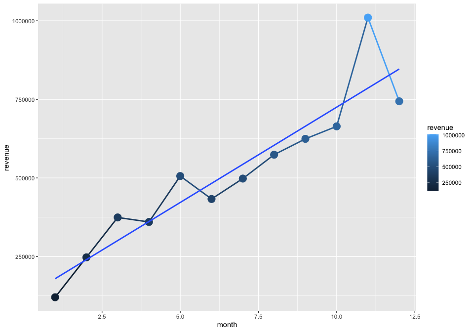
As mentioned earlier, if we specify an aesthetic within ggplot() it will be passed on to each geom that follows. But each geom layer can have its own aes specification by wrapping the attributes in the geoms into aes(). This will map these variables to other aesthetics e.g. the revenue to the size of the dots geom_point(aes(size = revenue)). You will see that the size of the dots varies then based on the amount of revenue and we will get another legend. This allows us to only show certain characteristics for that specific layer. If you wish to apply an aesthetic property to an entire geometry, you can set that property as an argument to the geom method, outside of the aes() call: geom_point(color = "blue") or geom_point(size = 5).
In summary variables are mapped to aesthetics with the aes() function, while fixed visual cues are set outside the aes() call. This sometimes leads to confusion, as in this example:
base_plot +
  # not what you want because 2 is not a variable
  geom_point(aes(size = 2),
  # this is fine -- turns all points red
  color = "red")
Step 3: Formatting
Once we have that, we can get into the formatting:
Range of your plot
To expand the range of a plot you can use expand_limit(). As arguments set y and/or x either to single values or a vector containing the upper and the lower limit (e.g. expand_limit(y = 0)). If you want to zoom into a certain area use coord_cartesian(ylim = c(ymin, ymax), xlim = c(xmin, xmax)) and set the values accordingly. If you don’t wrap ylim and xlim into coord_cartesian the values out of range will be dropped.
Scales
Aesthetic mapping (i.e., with aes()) only says that a variable should be mapped to an aesthetic. It doesn’t say how that should happen. For example, when mapping a variable to shape with aes(shape = categories) you don’t say what shapes should be used. Similarly, aes(color = revenue) doesn’t say what colors should be used. Describing what colors/shapes/sizes etc. to use is done by modifying the corresponding scale. In ggplot2, scales include:
- position
- color, fill, and alpha
- size
- shape
- linetype
ggplot automatically adds a particular scale for each mapping/ every aestethic to the plot to determine the range of values that the data should map to. This is the same as above with explicit scales:
revenue_by_month_tbl %>%
  # Canvas
  ggplot(aes(x = month, y = revenue, color = revenue)) +
  # Geometries
  geom_line(size = 1) +
  geom_point(size = 5) +
  geom_smooth(method = "lm", se = FALSE) +
  # same as above, with explicit scales
  scale_x_continuous() +
  scale_y_continuous() +
  scale_colour_continuous()
Scales are modified with a series of functions using a scale_<aesthetic>_<type> naming scheme. Try typing scale_<tab> to see a list of scale modification functions. A continuous scale will handle things like numeric data (where there is a continuous set of numbers), whereas a discrete scale will handle things like categories. While the default scales will work fine, it is possible to explicitly add different scales to replace the defaults. The following arguments are common to most scales in ggplot2:
- name: the first argument specifies the axis or legend title
- limits: the minimum and maximum of the scale
- breaks: the points along the scale where labels should appear
- labels: the text that appear at each break
Specific scale functions may have additional arguments; for example, the scale_color_continuous() function has arguments low and high for setting the colors at the low and high end of the scale.
Lets do the following formatting:
- Let the y-axis start at 0.
- change the color for revenue to a red-black-gradient (from the default dark-blue to light-blue gradient)
- update the labels to the dollar format and make it to millions (using
scales::dollar_format())
revenue_by_month_tbl %>%
  # Canvas
  ggplot(aes(x = month, y = revenue, color = revenue)) +
  # Geometries
  geom_line(size = 1) +
  geom_point(size = 5) +
  geom_smooth(method = "lm", se = FALSE) +
  # Formatting
  expand_limits(y = 0) +
  scale_color_continuous(low = "red", high = "black",
                         labels = scales::dollar_format(scale = 1/1e6, suffix = "M")) +
  scale_y_continuous(labels = scales::dollar_format(scale = 1/1e6, suffix = "M"))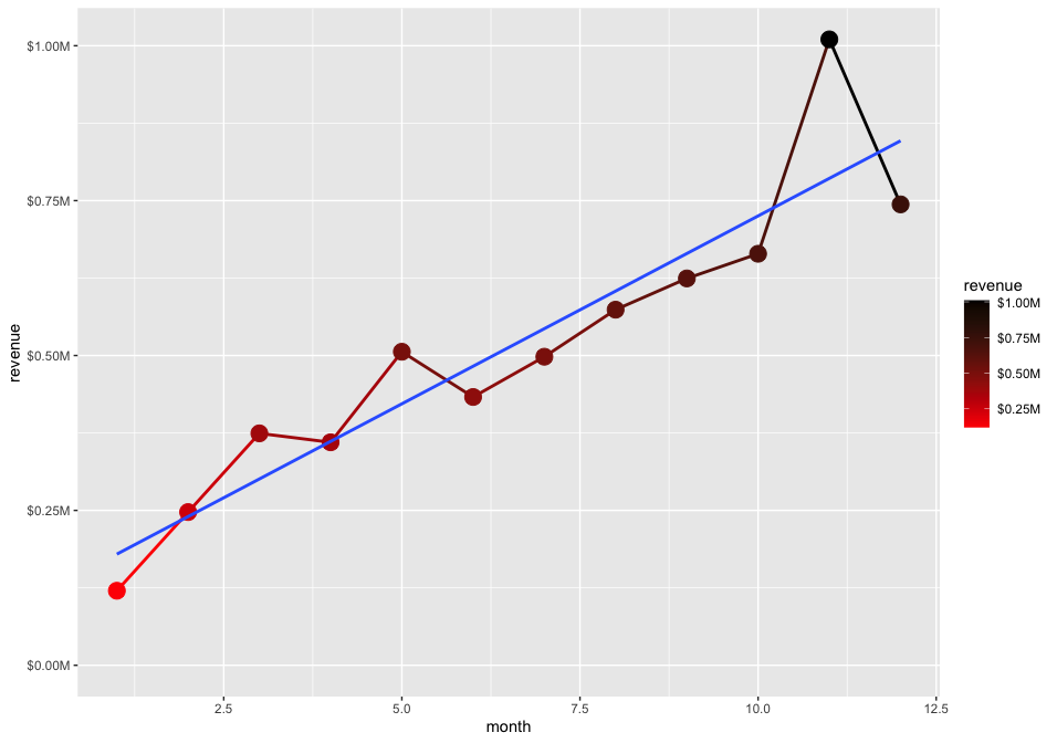
Labels
The title and axis labels can be changed using the labs() function with title, x and y arguments. Another option is to use the ggtitle(), xlab() and ylab().
Lets do the following formatting:
- Add labels
labs(
    title = "Revenue",
    subtitle = "Sales are trending up and to the right!",
    x = "",
    y = "Sales (Millions)",
    color = "Rev ($M)",
    caption = "What's happening?\nSales numbers showing year-over-year growth."
  )
Themes
ggplot comes with several complete themes which control all non-data display in a predfined way. Just add them as another layer. Examples are theme_bw, theme_light(), theme_dark(), theme_minimal(). See here for the list of the complete themes of ggplot2. There are also multiple other packages, that contain themes (e.g. ggthemes). Theme elements like the legend can be adjusted with the theme() function.
Lets do the following formatting:
- Add a theme
- Change the position and the direction of the legend
library(ggthemes)
theme_economist() +
theme(legend.position = "right", legend.direction = "vertical")
If we combine everything:
library(ggthemes)
g <- revenue_by_month_tbl %>%
  # Canvas
  ggplot(aes(x = month, y = revenue, color = revenue)) +
  # Geometries
  geom_line(size = 1) +
  geom_point(size = 5) +
  geom_smooth(method = "lm", se = FALSE) +
  # Formatting
  expand_limits(y = 0) +
  scale_x_continuous(breaks = revenue_by_month_tbl$month,
                     labels = month(revenue_by_month_tbl$month, label = T)) +
  scale_color_continuous(low = "red", high = "black",
                         labels = scales::dollar_format(scale = 1/1e6, suffix = "M")) +
  scale_y_continuous(labels = scales::dollar_format(scale = 1/1e6, suffix = "M")) +
  labs(
    title = "Revenue (2017)",
    subtitle = "Sales are trending up!",
    x = "",
    y = "Sales (Millions)",
    color = "Rev ($M)",
    caption = "What's happening?\nSales numbers showing month-over-month growth."
  )  +
  theme_economist() +
  theme(legend.position  = "right",
        legend.direction = "vertical",
        axis.text.x = element_text(angle = 45))
g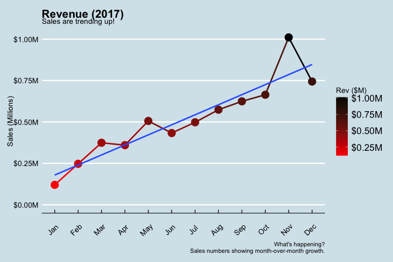
By running View(g) you see, that g is basically just a list containing all the information we just provided.
Factors
In the business case we are working with the data structure factors. R uses factors to handle categorical variables, variables that have a fixed and known set of possible values. Factors are also helpful for reordering character vectors to improve display. The goal of the forcats package is to provide a suite of tools that solve common problems with factors, including changing the order of levels or the values. forcats is part of the core tidyverse, so you can load it with library(tidyverse) or library(forcats).
Take a look at the following example:
library(tidyverse)
starwars %>%
  filter(!is.na(species)) %>%
  count(species, sort = TRUE)
## # A tibble: 37 x 2
##    species      n
##    <chr>    <int>
##  1 Human       35
##  2 Droid        6
##  3 Gungan       3
##  4 Kaminoan     2
##  5 Mirialan     2
##  6 Twi'lek      2
##  7 Wookiee      2
##  8 Zabrak       2
##  9 Aleena       1
## 10 Besalisk     1
## # … with 27 more rows
The function fct_lump() collapses the least/most frequent values of a factor into “other”. A positive value for the argument n preserves the most common n values. Negative n preserves the least common -n values. The argument w accepts an optional numeric vector giving weights for frequency of each value (not level) in f.
starwars %>%
     filter(!is.na(species)) %>%
     mutate(species = as_factor(species) %>%
                          fct_lump(n = 3)) %>%
     count(species)
## # A tibble: 4 x 2
##   species     n
##   <fct>   <int>
## 1 Human      35
## 2 Droid       6
## 3 Gungan      3
## 4 Other      39
Other useful functions are:
fct_reorder():Reordering a factor by another variable.
f <- factor(c("a", "b", "c", "d"), levels = c("b", "c", "d", "a"))
f
## a b c d
## Levels: b c d a
fct_reorder(f, c(2,3,1,4))
## a b c d
## Levels: c a b dfct_relevel(): allows you to move any number of levels to any location.
fct_relevel(f, "a")
## a b c d
## Levels: a b c d
fct_relevel(f, "b", "a")
## a b c d
## Levels: b a c d
# Move to the third position
fct_relevel(f, "a", after = 2)
## a b c d
## Levels: b c a d
# Relevel to the end
fct_relevel(f, "a", after = Inf)
## a b c d
## Levels: b c d a
fct_relevel(f, "a", after = 3)
## a b c d
## Levels: b c d a
For further information, see chapter Factors from R for Data Science.
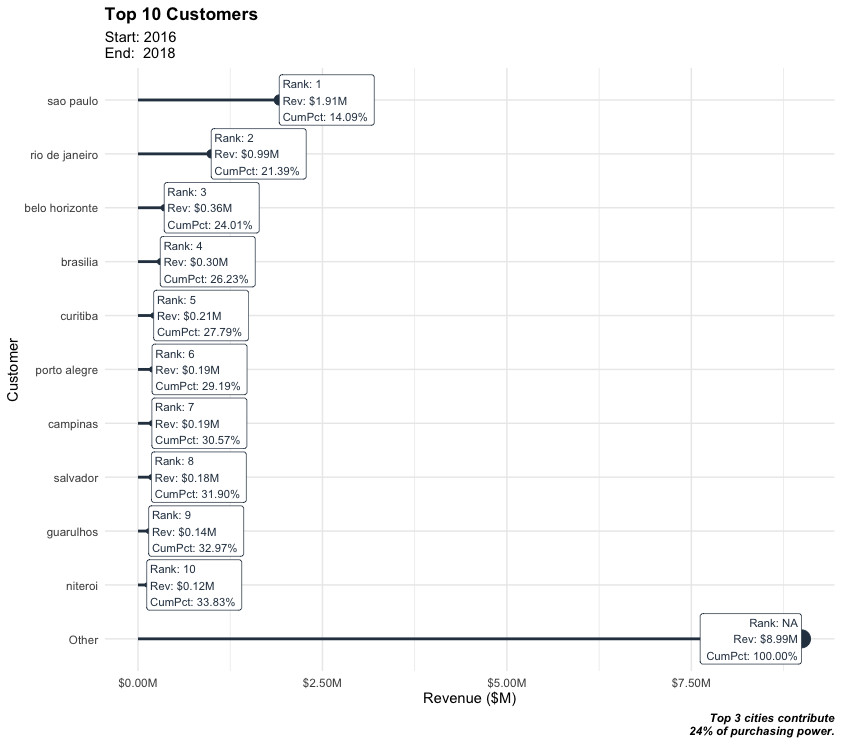
Business case
Case 1
- Question: How much purchasing power is in top 5 customer cities?
- Goal: Visualize top N customer cities in terms of revenue, include cumulative percentage.
1. Load libraries and data and join them together
# 1.0 Lollipop Chart: Top N Customers ----
library(tidyverse)
library(lubridate)
order_items_tbl <- read_rds("00_data/01_e-commerce/02_wrangled_data/order_items_tbl.rds")
orders_tbl      <- read_rds("00_data/01_e-commerce/02_wrangled_data/orders_tbl.rds")
customers_tbl   <- read_rds("00_data/01_e-commerce/02_wrangled_data/customers_tbl.rds")
order_lines_tbl <- order_items_tbl %>%
  left_join(orders_tbl) %>%
  left_join(customers_tbl)
2. Data manipluation
n <- 10
# Data Manipulation
top_customers_tbl <- order_lines_tbl %>%
  # Select relevant columns
  select(customer_city, price) %>%
  # Collapse the least frequent values into “other”
  mutate(customer_city = as_factor(customer_city) %>%
                         fct_lump(n = n, w = price)) %>%
  # Group and summarize
  group_by(customer_city) %>%
  summarize(revenue = sum(price)) %>%
  ungroup() %>%
  # Reorder the column customer_city by revenue
  mutate(customer_city = customer_city %>% fct_reorder(revenue)) %>%
  # Place "Other" at the beginning
  mutate(customer_city = customer_city %>% fct_relevel("Other", after = 0)) %>%
  # Sort by this column
  arrange(desc(customer_city)) %>%
  # Add Revenue Text
  mutate(revenue_text = scales::dollar(revenue, scale = 1e-6, suffix = "M")) %>%
  # Add Cumulative Percent
  mutate(cum_pct = cumsum(revenue) / sum(revenue)) %>%
  mutate(cum_pct_text = scales::percent(cum_pct)) %>%
  # Add Rank
  mutate(rank = row_number()) %>%
  mutate(rank = case_when(
    rank == max(rank) ~ NA_integer_,
    TRUE ~ rank
  )) %>%
  # Add Label text
  mutate(label_text = str_glue("Rank: {rank}\nRev: {revenue_text}\nCumPct: {cum_pct_text}"))
3. Data visualization
# Data Visualization
top_customers_tbl %>%
    # Canvas
    ggplot(aes(x = revenue, y = customer_city)) +
    # Geometries
    geom_segment(aes(xend = 0, yend = customer_city),
                 color = palette_light()[1],
                 size  = 1) +
    geom_point(aes(size = revenue),
               color = palette_light()[1]) +
    geom_label(aes(label = label_text),
               hjust = "inward",
               size  = 3,
               color = palette_light()[1]) +
    # Formatting
    scale_x_continuous(labels = scales::dollar_format(scale = 1e-6, suffix = "M")) +
    labs(
      title = str_glue("Top {n} Customers"),
      subtitle = str_glue("Start: {year(min(order_lines_tbl$order_purchase_timestamp))}
                            End:  {year(max(order_lines_tbl$order_purchase_timestamp))}"),
      x = "Revenue ($M)",
      y = "Customer",
      caption = str_glue("Top 3 cities contribute
                           24% of purchasing power.")
    ) +
    theme_minimal() +
    theme(
      legend.position = "none",
      plot.title = element_text(face = "bold"),
      plot.caption = element_text(face = "bold.italic")
    )
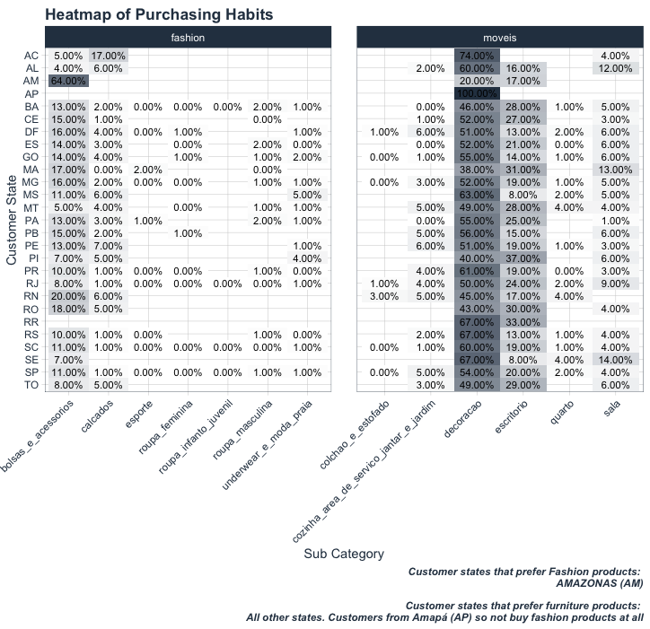
Case 2
- Question: Do specific customers have a purchasing preference?
- Goal: Visualize heatmap of proportion of sales by sub category for the categories fashion & furniture. Since Heatmaps are great for showing details in 3 dimensions, show the results for each customer state.
1. Load libraries and data and join them together
# 2.0 Heatmaps ----
library(tidyverse)
library(tidyquant) # For colors
order_items_tbl <- read_rds("00_data/01_e-commerce/02_wrangled_data/order_items_tbl.rds")
orders_tbl      <- read_rds("00_data/01_e-commerce/02_wrangled_data/orders_tbl.rds")
products_tbl    <- read_rds("00_data/01_e-commerce/02_wrangled_data/products_tbl.rds")
customers_tbl   <- read_rds("00_data/01_e-commerce/02_wrangled_data/customers_tbl.rds")
# Data Manipulation
# Joing together
order_lines_tbl <- order_items_tbl %>%
  left_join(orders_tbl) %>%
  left_join(customers_tbl) %>%
  left_join(products_tbl)
2. Data manipluation
# Select columns and filter categories
pct_sales_by_state_tbl <- order_lines_tbl %>%
  select(customer_state, main_category_name, sub_category_name, price) %>%
  filter(main_category_name == "fashion" | main_category_name == "moveis") %>%
  # Group by category and summarize
  group_by(customer_state, main_category_name, sub_category_name) %>%
  summarise(total_revenue = sum(price)) %>%
  ungroup() %>%
  # Group by state and calculate revenue ratio
  group_by(customer_state) %>%
  mutate(pct = round((total_revenue / sum(total_revenue)), digits = 2)) %>%
  ungroup() %>%
  # Reverse order of states
  mutate(customer_state = as.factor(customer_state) %>% fct_rev()) %>%
  mutate(customer_state_num = as.numeric(customer_state))
3. Data visualization
# Data Visualization
pct_sales_by_state_tbl %>%
  ggplot(aes(sub_category_name, customer_state)) +
  # Geometries
  geom_tile(aes(fill = pct)) +
  geom_text(aes(label = scales::percent(pct)),
            size = 3) +
  facet_wrap(~ main_category_name, scales = "free_x") +
  # Formatting
  scale_fill_gradient(low = "white", high = palette_light()[1]) +
  labs(
    title = "Heatmap of Purchasing Habits",
    x = "Sub Category",
    y = "Customer State",
    caption = str_glue(
      "Customer states that prefer Fashion products:
        AMAZONAS (AM)
        Customer states that prefer furniture products:
        All other states. Customers from Amapá (AP) so not buy fashion products at all")
  ) +
  theme_tq() +
  theme(
    axis.text.x = element_text(angle = 45, hjust = 1),
    legend.position = "none",
    plot.title = element_text(face = "bold"),
    plot.caption = element_text(face = "bold.italic")
  )
Challenge
Create at least 2 plots.
- For the first one use the olist data and create a
violin plotthat shows the price distribution for whatever categories you choose. - Take the covid data from the last session and map the death / cases over the time. Show the trend for the entire world as well as for Germany and the USA (
line plot). - Optional: Create a
worldmapand color the countries according to the fatality (total deaths per capita). If it is easier for you, you can do it also just for the states of the USA or any other state (you need to get a different dataset though).